

Pick the winner!
530 members have voted
Announcements
-
Similar Content
-
-
Latest Posts
-
By Dose Pipe Sutututu · Posted
Red Bull, if you're reading this thread, please sponsor us 🥲 -

By robbo_rb180 · Posted
Just need to find some sponsor dollars and we'd be good to go. -
By Dose Pipe Sutututu · Posted
I reckon if we all banded together, we'll make a great race team (build, fab, tune, pit, race) all under one roof. No need for external vendors. -
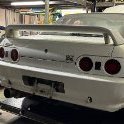
 Anyone have the part number for this? Edit: Just seen it could be either left or right that has snapped, any tips on how to tell which?
 -

-


Recommended Posts