Jump to content
SAU Community

Recommended Posts

I prefer Micks, but not fond of the AU going down the page. I would prefer the url to be in lower case, all uppercase is okay for the name, because thats keeping the standard, but all uppercase isn't easy on the eyes for reading (one of the first things you learn in publishing).

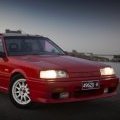
I've put it up in lower case for interest sake, will leave it up to someone else to decide if the AU should go or not. Do we have copyright on the background, is it one of our shots? We'll need permission from Justin for his photo too (if its one of his).

post-28428-1200042333_thumb.jpg

  • Replies 44
  • Created
  • Last Reply

Top Posters In This Topic

Top Posters In This Topic

Posted Images

I think thats getting there, But I'm not a big fan of the SAU down the side, it looks asymetrical and out of place, when everything else is so symetrical. Plus we allready have it highlighted in red :(

Its definantly a good picture though, but where is the starlet? :D

Edited by TURISMO
I think thats getting there, But I'm not a big fan of the SAU down the side, it looks asymetrical and out of place, when everything else is so symetrical. Plus we allready have it highlighted in red :)

Its definantly a good picture though, but where is the starlet? :rolleyes:

We were looking at the general design, so it looks like the verticle SAU is out with 1 suggestion and 2 no's so far.

We will probably try for a more recent picture that includes a models R31 to R34. Would love a v35 or the new GTR :-)

Maybe if Bob who hangs out at Inline still ends up getting one like he said he would, we could convince him? Ill have a chat to him next time im out there.

Im also against the SAU going down the side.

I need to know solid info: dimensions, what everyone likes / dislikes about this one, what colours should be used, whether we need a more up to date photo, what background etc...

Its all good to have a thread about a banner but who is going to design it? Should we have a competition and all vote on our favourite? - Otherwise we're never going to agree.

post-17958-1200289235_thumb.jpg

^^

Alsome Pic, man.

Vote one for that kind of pic on it.

My input is that the center car shoudn't be black. just puts to much black in the pic. My personal opinon. Would be fine if the side car was a differnt colour to

Edited by BNR32t

my 2c

I wouldnt have that pic. To me it is saying: This is our club and these are the cars in it. I assume you'll be wanting to use the banner for years to some, and members come and go, and cars are bought and sold.

I'd prefer a more stylized design like some massive tailights, merged with a canberra feature such as the parliament house flag, merged with text that stands out.

As for the text, i would forget about trying to do the SAU thing... I think it's too distracting...better to make it easy to read and obvious what the name is.

Just have something like

SKYLINES AUSTRALIA

A.C.T.

and maybe the website somewhere.

I agree,

I also like the black one :D

What is everyones problem with black or dark????

Solid white or outline white lettering on a dark background stands out much more to the reader than the standard black on white...

Is anyone else going to submit something or decide on some dimensions?? Or am I the only person interested in making contributions to the design?

I like the black one of mick's too, but it would be good to see some test prints at about A3 size to get a better idea of how it will really look. A freind of mine is a graphic designer and would be able to give it a tidy up and resize for printing (both the test ones and full size). As with most printing, the more colours used the more expensive it gets; i don't know what prices have been gathered, but the simpler ideas are usually cheaper to produce and often look better.

Anyways, the style on mick's banner was what i had in mind when i came up with mine. The major difference is that i am trying to show the evolution of the skyline rather than just the best looking one (as if we don't all want a 34 GTR!)

SKYLINESAUSTRALIA

OO O_O OO OO oO oO

or

SKYLINESAUSTRALIA

OO O_O OO oO oO

I am putting my hand up to help out in any way i can. I would really like to see the banner up at wheels in march (hopefully tied to the federal tent so we are out of the sun again) let's get this ball rolling :blink:

Donnan

Create an account or sign in to comment

You need to be a member in order to leave a comment

Create an account

Sign up for a new account in our community. It's easy!

Register a new account

Sign in

Already have an account? Sign in here.

Sign In Now


  • Similar Content

  • Latest Posts

    • Yeah, that's fine**. But the numbers you came up with are just wrong. Try it for yourself. Put in any voltage from the possible range and see what result you get. You get nonsense. ** When I say "fine", I mean, it's still shit. The very simple linear formula (slope & intercept) is shit for a sensor with a non-linear response. This is the curve, from your data above. Look at the CURVE! It's only really linear between about 30 and 90 °C. And if you used only that range to define a curve, it would be great. But you would go more and more wrong as you went to higher temps. And that is why the slope & intercept found when you use 50 and 150 as the end points is so bad halfway between those points. The real curve is a long way below the linear curve which just zips straight between the end points, like this one. You could probably use the same slope and a lower intercept, to move that straight line down, and spread the error out. But you would 5-10°C off in a lot of places. You'd need to say what temperature range you really wanted to be most right - say, 100 to 130, and plop the line closest to teh real curve in that region, which would make it quite wrong down at the lower temperatures. Let me just say that HPTuners are not being realistic in only allowing for a simple linear curve. 
    • I feel I should re-iterate. The above picture is the only option available in the software and the blurb from HP Tuners I quoted earlier is the only way to add data to it and that's the description they offer as to how to figure it out. The only fields available is the blank box after (Input/ ) and the box right before = Output. Those are the only numbers that can be entered.
    • No, your formula is arse backwards. Mine is totally different to yours, and is the one I said was bang on at 50 and 150. I'll put your data into Excel (actually it already is, chart it and fit a linear fit to it, aiming to make it evenly wrong across the whole span. But not now. Other things to do first.
    • God damnit. The only option I actually have in the software is the one that is screenshotted. I am glad that I at least got it right... for those two points. Would it actually change anything if I chose/used 80C and 120C as the two points instead? My brain wants to imagine the formula put into HPtuners would be the same equation, otherwise none of this makes sense to me, unless: 1) The formula you put into VCM Scanner/HPTuners is always linear 2) The two points/input pairs are only arbitrary to choose (as the documentation implies) IF the actual scaling of the sensor is linear. then 3) If the scaling is not linear, the two points you choose matter a great deal, because the formula will draw a line between those two points only.
    • Nah, that is hella wrong. If I do a simple linear between 150°C (0.407v) and 50°C (2.98v) I get the formula Temperature = -38.8651*voltage + 165.8181 It is perfectly correct at 50 and 150, but it is as much as 20° out in the region of 110°C, because the actual data is significantly non-linear there. It is no more than 4° out down at the lowest temperatures, but is is seriously shit almost everywhere. I cannot believe that the instruction is to do a 2 point linear fit. I would say the method I used previously would have to be better.
×
×
  • Create New...